

The Best Summer Fonts in Canva That Make Your Designs Look Better Instantly
- May 4
- 4 min read
There is something about summer content that just hits differently.
The colors are lighter, the mood is softer, everything feels a little more relaxed and effortless. But if you have ever opened Canva, chosen a beautiful beach photo, added text… and it still felt a bit off, you are not alone.

A lot of the time, the missing piece is the font.
Fonts carry the entire mood of your design. They decide whether your graphic feels calm, bold, playful, or high-end. And once you start choosing the right ones, everything else becomes so much easier.
I pulled together some of my favorite beach and summer fonts in Canva. These are the ones that actually look beautiful in real designs and not just in the preview.
Perandory Condensed

This font has that tall, editorial feel that immediately elevates your design.
It feels very intentional and very styled, like something you would see on a magazine cover or a luxury summer campaign. The thin, elongated letters create a clean look that works so well with simple backgrounds like water, sky, or soft textures.
When you use this font, you do not need to do too much. A clean background and good spacing already gives you that polished look.
Para
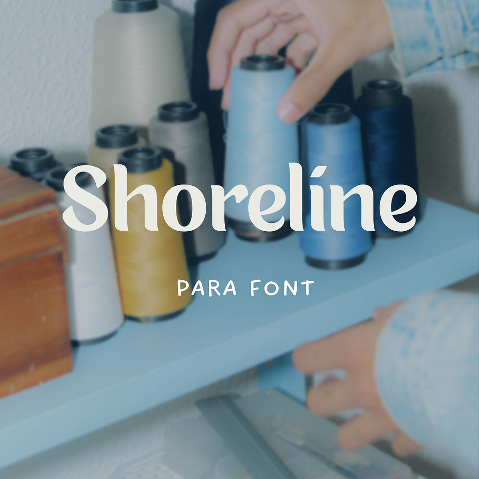
Para is calm and minimal in the best way.
It has a soft, rounded feel that makes your design look approachable and easy to read. This is one of those fonts that blends into your design while still making everything feel cohesive.
If you are creating content that feels relaxed and lifestyle-focused, this font helps you achieve that without overthinking it.
Berkshire Swash
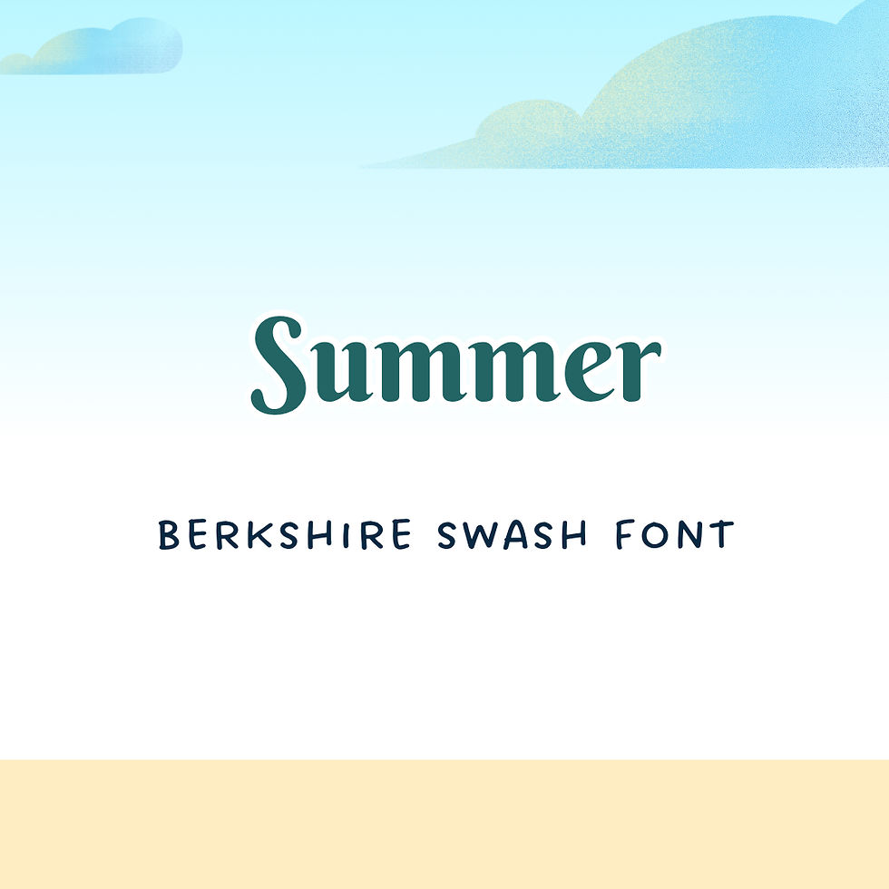
This one brings a gentle, feminine energy to your designs.
The curves add personality, but it still feels neat and controlled. It works beautifully when you want your content to feel soft and pretty without becoming overly decorative.
It has that “effortless summer” feel that works so well for quotes, lifestyle content, or anything that leans slightly romantic.
Manison Condensed

Manison Condensed is clean, simple, and very reliable.
It gives your design structure. Everything feels organised and easy to follow when this font is used well. It is especially useful when you want your design to look modern without being too bold.
This is the kind of font you can come back to again and again, especially when you want something that looks professional without spending too much time experimenting.
Edo

Edo has a completely different energy.
It is bold, textured, and full of movement. The brush-style strokes make it feel lively and expressive, which works beautifully for summer content that is meant to stand out.
When you use this font, your design immediately feels more dynamic. It draws attention and creates a strong focal point without needing additional elements.
Tan Nimbus

Tan Nimbus feels playful and warm.
The rounded edges and slightly bouncy lettering give it a cheerful personality that works perfectly for bright summer visuals.
It adds a sense of fun without feeling childish, which can sometimes be difficult to balance.
It works especially well when your design already has warm tones like sand, citrus, or sunlight.
Black Mango

Black Mango feels polished with a relaxed edge.
It sits nicely between bold and subtle, which makes it very versatile.
The structure of the letters keeps everything looking neat, while the style still feels light enough for summer content.
It is one of those fonts that quietly pulls your design together without taking over.
WC Mano Negra Bold
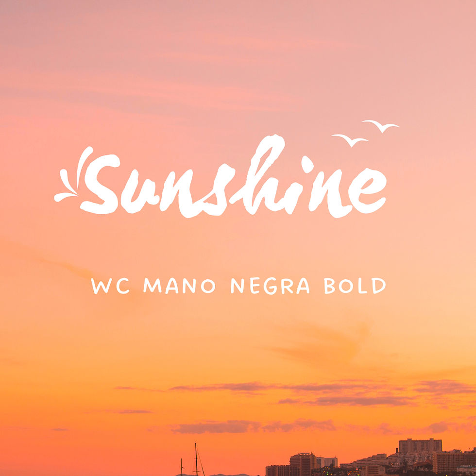
This font has that handwritten, free-flowing look that feels very natural.
It brings a sense of ease to your design, almost like it was created without effort. That relaxed feeling works so well for summer visuals where you want things to feel less structured and more organic.
It adds personality without making your design feel crowded.
Angelina

Angelina is a soft script that feels both pretty and polished.
The strokes are smooth and slightly elegant, which makes it easy to use across different types of content. It adds a gentle decorative touch while still keeping everything readable.
It works beautifully when layered over soft backgrounds like sunsets, skies, or light textures.
Best Light

Best Light is airy and understated.
It allows your background to breathe while still adding a subtle layer of text.
This font is perfect when you want your design to feel light and uncluttered.
It creates space, which is something that makes a design feel calm and intentional.
Halimum
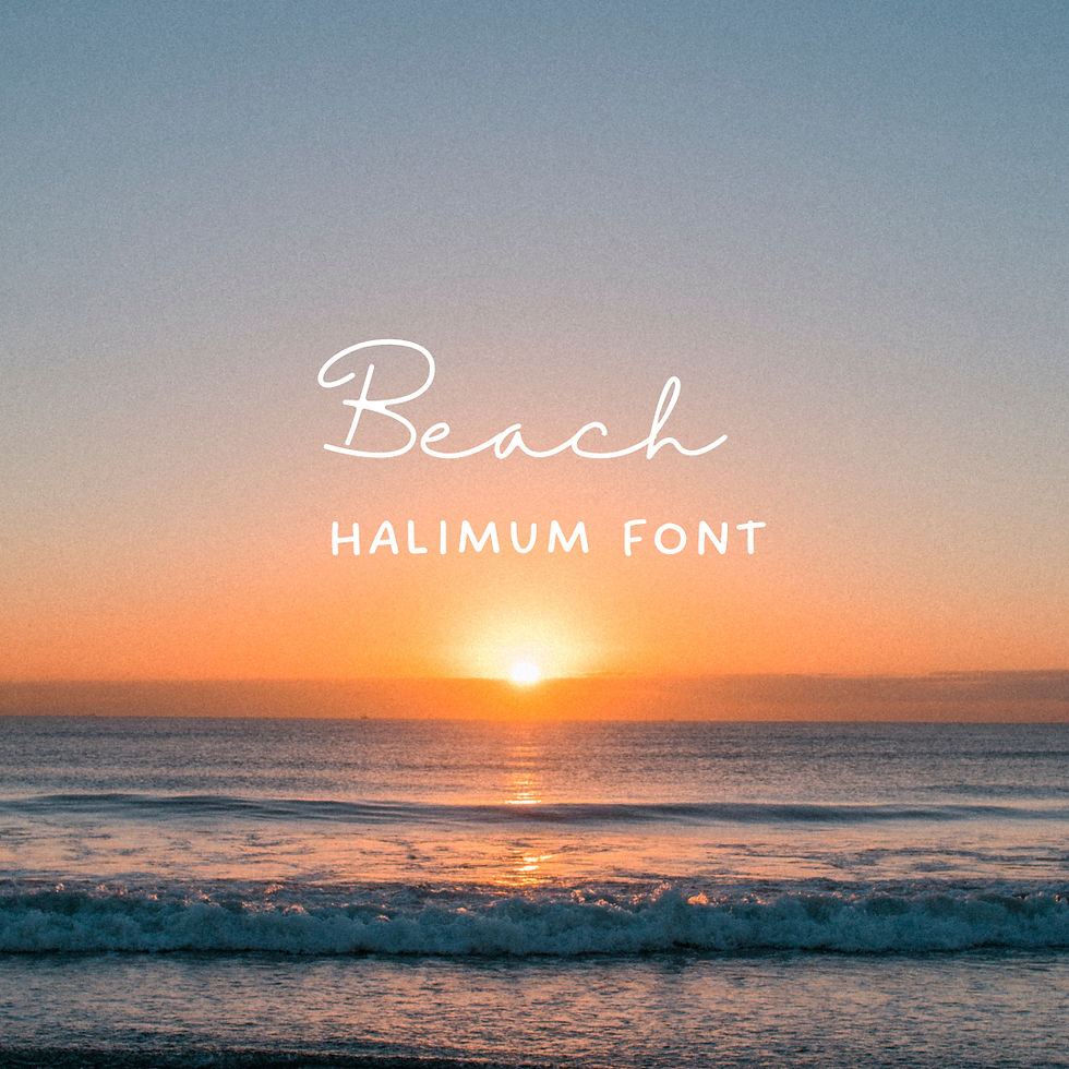
Halimum has that classic beach script feel.
It looks natural on ocean backgrounds, sunset photos, and travel-style visuals. The flow of the letters feels smooth and relaxed, which fits perfectly with summer themes.
It gives your design a soft, handwritten finish that feels very on-brand for beach content.
Magnolia Script
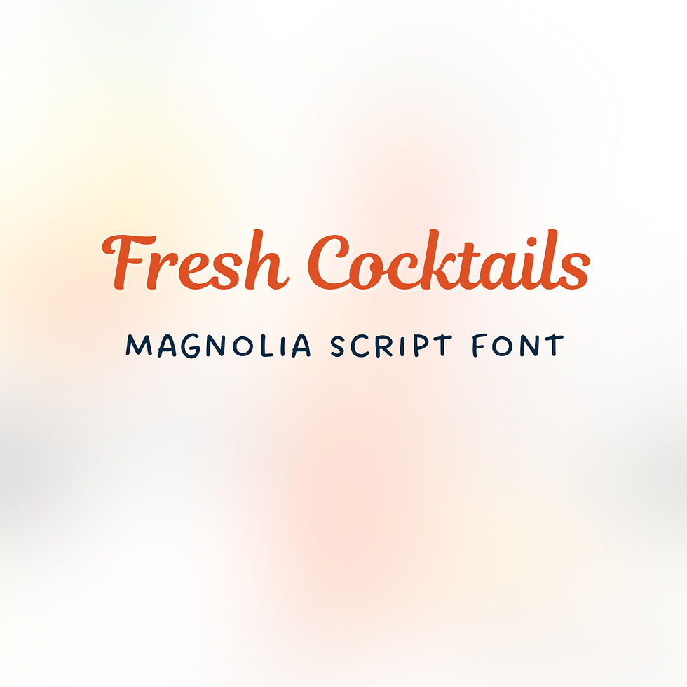
Magnolia Script feels slightly more refined.
It still has that soft script style, but with a cleaner finish that makes it feel a bit more elevated.
It works beautifully for designs that lean towards a more styled or curated summer aesthetic.
It brings warmth while still keeping everything looking neat.
Beautifully Delicious Script

This font has a really soft, flowing feel that instantly gives your design that calm, beachy mood.
There is something about the way the letters connect that feels very natural, almost like handwriting on a summer postcard. It does not feel forced or overly styled. It just sits nicely on the page and lets the background do its thing.
When you place it over water textures or soft ocean tones like this, everything starts to feel more intentional.
What Actually Makes These Fonts Work So Well
Once you start using these fonts, you will notice something.
Your designs begin to feel more intentional, even when they are simple.
A good summer design often comes down to a few key things:
clear font choice
enough spacing
a background that supports the mood
When those three things come together, everything starts to look more refined.
You do not need a complicated layout. You do not need ten different elements on your page. You just need the right combination of font and space.
Final Thoughts on Beach and Summer fonts.
Summer designs are meant to feel easy, soft, and a little bit effortless.
When you choose fonts that match that feeling, your content naturally becomes more visually appealing. You spend less time adjusting things and more time actually creating.
And the best part is that once you find a few fonts you love, you can reuse them again and again across your content, your Pinterest pins, and even your digital products.


Comments