

Earthy Boho Color Palettes with Hexcodes for Your Canva Brand Kit
- Nov 13, 2025
- 4 min read
If you’re trying to give your brand a calm, natural, and grounded look, earthy boho colors are a beautiful place to start. These shades take inspiration from nature to create visuals that feel warm and effortless.
In a hurry? Save this!

In this post, you’ll find ten earthy boho color palettes you can use for your branding, website, or social media. Each one blends natural tones with soft contrast, helping your brand feel cohesive, organic, and timeless.
Whether you’re designing a logo or refreshing your Instagram, these palettes make your visuals instantly more intentional and beautifully balanced.
Earthy boho color palettes and how to use them
1. Mountain Trail
Hexcodes:
Imagine a brand that feels calm, earthy and a little moody; this palette exudes just that. It's a palette that is great for brands that want a relaxed, natural and rustic look.
How to use: Use the deeper shades for headers and backgrounds, and the lighter greys for clean text areas or overlays.

2. Green Sanctuary
Hexcodes:
If you love fresh greens and gentle neutrals that feel clean and nature-inspired, this one is for you. Perfect for wellness, eco-friendly brands or anything calming and organic.
How to use:
Use the greens for accents and branding elements. Use the soft cream as your main background colour.

3. Golden Fields (with Blush Accent)
Hexcodes:
Warm browns and a touch of blush that feel cozy and sunlit. Lovely for handmade shops, home décor brands or anyone who loves warm, timeless tones.
How to use:
Use the blush as your pop of color, and the taupe or honey beige as your main brand background.

4. Clay & Sunlight
Hexcodes:
This palette includes clay and olive shades that feel warm, grounded and simple. Superb for lifestyle, interiors or any brand that leans into slow, calm living.
How to use:
Use clay and sandstone for backgrounds, and dusty sage as a highlight or call-to-action color.

5. Desert Dawn
Hexcodes:
Perfect for creative, feminine or beauty-focused brands, this palette is made up of soft pinks and muted sage that feel peaceful and gentle.
How to use:
Use the pinks for soft accents and the sage or teal for contrast in headers or buttons.

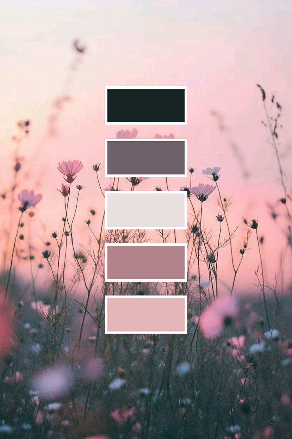
6. Blush Meadow
Hexcodes:
Now this is a pretty mix of blush pinks and deeper tones for a soft but strong look. Great for boutiques, florists or modern feminine brands.
How to use:
Use charcoal for text or contrast. Use blush and mauve for backgrounds, highlights and graphics.
7. Wildflower Boho
Hexcodes:
This one is a classic. Warm golds and bold pinks mixed with navy make it very colourful but still earthy.Perfect for fun, creative brands that want personality and warmth.
How to use:
Use the deep navy for text and the golden apricot or rosewood for standout design elements.

8. Misty Horizon
Hexcodes:
Love minimalist hues? this one will be a great pick for your brand. It has cool blues and greys that feel clean, calm and airy. Great for minimalist or peaceful, thoughtful brands.
How to use:
Use the soft shell as your main background and the deeper blues for contrast in headings or graphics.

9. Ethereal Bloom
Hexcodes:
Light, dreamy pastels that feel airy and feminine. Perfect for beauty, stationery, lifestyle or any soft, pretty brand.
How to use:
Use the lightest pinks for backgrounds and lavender as your standout accent shade.

10. Spring Revival
Hexcodes:
A fresh mix of rose, teal and soft neutrals that feels uplifting and modern.Great for lifestyle, wellness or creative brands wanting a clean, bright refresh.
How to use:
Use the lightest pinks for backgrounds and lavender as your standout accent shade.

11. Rustic Brushstrokes
Hexcodes:
This palette feels warm, rustic and handmade. It has that cozy, creative boho look that feels very down-to-earth. Really perfect for handmade shops, craft businesses, lifestyle bloggers, home décor brands or anyone who wants their visuals to feel warm, textured and natural.
How to use: Use Weathered Stone or Soft Sand Beige as your main background, Terracotta Rose as your pop of colour, and Charcoal Brown for headings or contrast.

12. Soft Bloom Sky
Hexcodes:
Light, dreamy and airy, this palette feels like a soft morning sky with gentle blossoms. It’s calm, uplifting and beautifully minimal. Also perfect for wellness brands, minimalist creators, photographers, feminine lifestyle blogs, or any brand wanting a clean, peaceful look.
How to use: Use Morning Mist or Cream Blossom as your main base, Powder Blue for accents, and Pale Wheat to add warmth without losing the soft look.

Final thoughts - Choosing Your Signature earthy Boho Palette
The secret to building a timeless brand is in finding the five shades that feel most like you.
If you’re drawn to muted browns and blush tones, start with Golden Fields or Clay & Sunlight. If you love calm blues and greens, explore Misty Horizon or Green Sanctuary. Or, if you’re ready for something creative and feminine, Spring Revival will breathe new life into your visual identity.
Whichever palette you choose, let it tell your story: earthy, balanced, and beautifully imperfect.


Comments