

30+Spring Fonts on Canva to Brighten your Easter Designs
- Dec 16, 2025
- 4 min read
Ready to make Easter designs that are actually scroll-stopping?These beautiful Canva font combinations are perfect for Easter designs, spring graphics, church posts, kids’ printables, invitations, flyers, and social media.

If you’ve ever opened Canva and thought, how do I find the right font for this? you’re not alone. That’s why I pulled together these spring-ready Canva font combinations to make it easy to choose fonts that feel light, pretty, and put-together without overthinking your Spring and Easter project. Let's dive in!
1. Lulu Font TH + Beautiful
If you’re creating Easter brunch menus, recipe cards, or anything cozy and homemade, this combo is a lovely choice. Lulu Font TH feels playful and soft, while Beautiful adds that handwritten, personal touch.

2. Londrina Solid + Roboto Condensed
This one is great if you need something fun but clear. Londrina Solid grabs attention for headings, and Roboto Condensed keeps the details neat. Perfect for egg hunt flyers, event posters, or school notices.

3. Blueberry + Glacial Indifference
If you’re working on Easter presentations or clean announcements, this pairing feels fresh without being boring. Blueberry adds friendliness, while Glacial Indifference keeps everything modern and tidy.

4. Bellaboo + Borsok
This combo is playful and bold at the same time. If you’re designing Easter cards, kids’ printables, or scrapbook covers, these fonts feel cheerful and easygoing.

5. Moontime + Tan Pearl
If your design is more sentimental or faith-based, this pairing works beautifully. Moontime feels soft and flowing, while Tan Pearl adds a calm, elegant balance. Great for keepsakes or devotional designs.

6. Borsok + Nunito
This is a very safe, easy pairing when you just want things to look good fast. Borsok works well for headings, and Nunito keeps body text readable. Ideal for worksheets, flyers, or simple Easter announcements.

7. Breathing + Alice
If you’re creating Easter sales graphics or boutique-style posts, this combo feels airy and polished. Breathing adds personality, and Alice keeps everything grounded and clean.

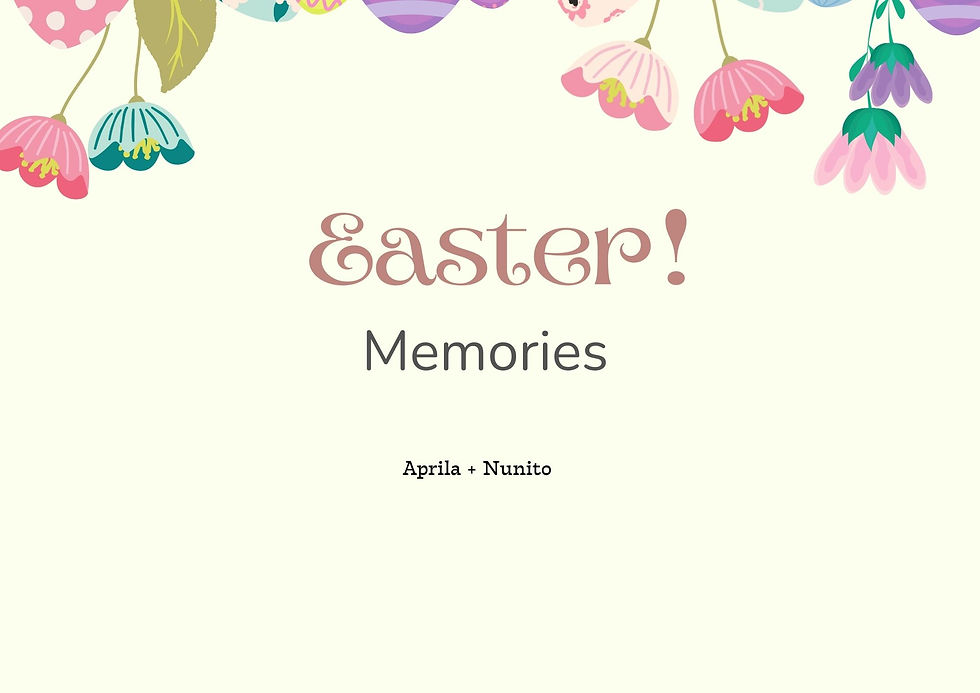
8. Aprila + Nunito
This pairing works really well for memory books, photo captions, or printable keepsakes. Aprila adds charm, and Nunito makes sure nothing feels cluttered.
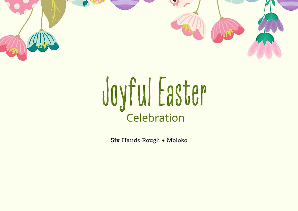
9. Six Hands Rough + Moloko
If you’re designing craft projects, handmade signs, or creative Easter posters, this combo has a fun, imperfect look that feels very intentional and artsy.
10. Aleo + Glacial Indifference
This is a great option if you like clean designs with a little warmth. It works well for spring blog graphics, floral announcements, or minimalist Easter posts.

11. Abril Fatface + TT Milks Script
If you’re creating bold Easter headers or seasonal promos, this combo really stands out. Abril Fatface brings the drama, and TT Milks Script softens it so it still feels friendly.

12. Balabeloo + Jua
This one feels fun and approachable. If you’re designing Easter Monday posts, school graphics, or family-focused content, these fonts keep things light and easy to read.

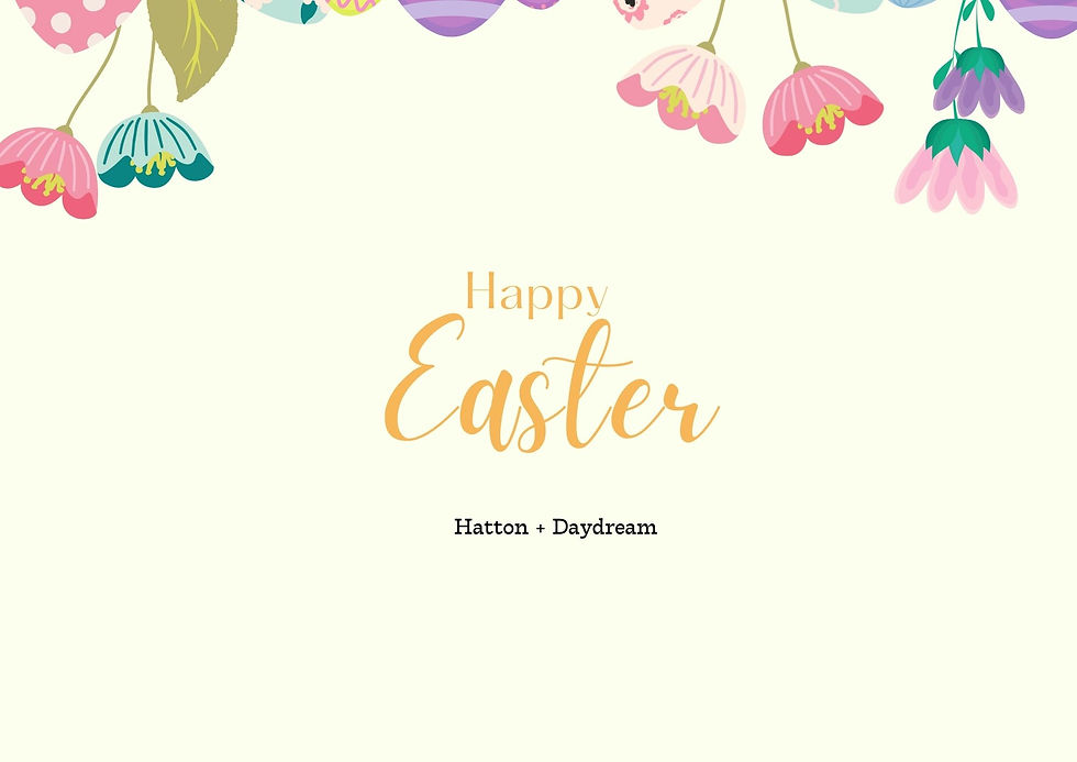
13. Hatton + Daydream
If you want something soft and pretty, this combo is a go-to. It works beautifully for Easter greetings, invitations, or pastel-themed designs.
14. Apricots + Glacial Indifference
This pairing feels calm and modern with a seasonal twist. If you’re creating faith-based posts, simple cards, or minimal Easter graphics, this one fits perfectly.

15. Open Sauce + Shadow Script
If you’re designing Easter quotes or meaningful messages, this combo looks beautiful without feeling overdone. It works especially well on neutral or light backgrounds.

Quick tips before you go
How to Use These Fonts for Easter Designs (Without Overthinking It)
These font combinations are meant to make Easter designs feel light, cheerful, and put-together with very little effort.
Here’s how to actually use them.
Let one font do the talking
Use the fun or decorative font for just one or two words, then let the simpler font handle the rest.This keeps your design looking clean instead of busy.
If both fonts are shouting, nothing stands out.
Stick to soft spring colours
Pastels and muted tones work beautifully with Easter fonts. Try colors like blush, sage, butter yellow, lilac, or soft blue. If you use a bright colour, use it once and not everywhere.
Give your design some breathing room
You don’t need to fill every space. Leaving empty space around your text actually makes your fonts look better and more intentional.If you’re unsure, remove something instead of adding more.
Match the font to the message
Different Easter designs call for different moods:
Faith-based or meaningful quotes → soft scripts + clean fonts
Kids or family designs → rounded, playful fonts
Flyers or events → bold headline font + simple body font
Minimal designs → one font, two sizes
Let the message guide your font choice.
Repeat, don’t mix
If you’re using flowers, shapes, or lines simply repeat the same style. Mixing too many elements can make even great fonts feel cluttered.
Centre it if you’re unsure
Centred text is an easy win for Easter designs. It looks calm, balanced, and works well for cards, church graphics, printables, and social posts.
Always check it small
Zoom out or view your design on your phone. If it still looks clear and pretty, your font choice is doing its job.


Comments